
Mar 24, 2022
A Dashboarding Tool with Bird APIs
Il y a près d'un an, Tom Mairs, directeur de la réussite des clients de Bird, a écrit un outil de publipostage utilisant les API de Bird . Dans ce billet, je reprends là où il s'est arrêté. Son outil permet la transmission programmée des tâches, mais qu'en est-il si nous voulons créer nos propres tableaux de bord et journaux d'événements ?
Perhaps I want to create a specific dashboard for a business group or a customer-facing dashboard, but not provide users full access à la Bird UI. This script just touches the surface of what is possible utilizing Python, Plotly Dash, and nos API.
As I began my search online, I wanted to find the path of least resistance. I could have created all the dashboards and UI myself in HTML and python, however, after some Google searching, I came across Le tiret de Plotly, which integrates easily with python. I chose Dash for 2 reasons: 1) it is open source, and 2) after reading the documentation it seemed easily customizable for what I was trying to do. Dash est une bibliothèque open-source idéale pour créer et déployer des applications de données avec des interfaces utilisateur personnalisées. This made creating a UI extremely simple. Le question then became, how complex did I want to make this app? Le more time I spent, the more features I wanted to add.
For the initial project, I wanted to ensure that I had a dashboard with customizable metrics and a selectable timeframe. Initially, I started with a dashboard where you could only pick one metric from the dropdown. Then, as I got feedback from colleagues, I refined the dashboard a little bit to add multi-select and axis titles. I also decided to add an additional tab for an events log. I came à la point where I was satisfied with what I had as a good starting point for anyone wishing to build out their own dashboards. Of course, I put the project in Github for you to clone or branch.
Pour commencer
To access this app, you will need to ensure you are running python 3.10 or above and install the following libraries:
demande
dash
pandas
Then, input your API key into App.py and run the app. It will run on http://localhost:8050. For further information on deploying this to a public-facing server (such as AWS), see the following resources:
Création de la page du tableau de bord
Il faut d'abord initialiser le cadre de données et le tableau de bord. Sans initialisation du tableau de bord, aucun tableau de bord n'apparaîtra dans l'interface utilisateur.
df = pd.DataFrame({
"Compte" : [0,0],
"Temps" : [0,0]
})
fig = px.line(df,x="Time",y="Count")
Then, build out the first tab. This is a combination of an app callback (to check which tab is being utilized); along with a conditional function to check which tab is currently selected. The code below builds out only the blank dashboard and UI elements (we will get to the events tab later on). The dcc elements are the Composants de base de Dash and the Composants HTML easily allow for HTML to be used in the UI.
html.H2('Tableau de bord analytique'),
#Déroulant multi-sélection
dcc.Dropdown(['Count Accepted', 'Count Admin Bounce', 'Count Block Bounce', 'Count Bounce', 'Count Clicked', 'Count Delayed', 'Count Delayed First', 'Count Delivered', 'Count Delivered First', 'Count Delivered Subsequent','Échec de la génération du compte', 'Rejet de la génération du compte', 'Rebond dur du compte', 'Rebond en bande', 'Rendu initial du compte', 'Injecté', 'Rebond hors bande du compte', 'Rejet de la politique du compte', 'Rejeté du compte','Count Rendered', 'Count Sent', 'Count Soft Bounce', 'Count Spam Complaint', 'Count Targeted', 'Count Undetermined Bounce', 'Count Unique Clicked', 'Count Unique Confirmed Opened', 'Count Unique Initial Rendered','Count Unique Rendered', 'Count Unsubscribe', 'Total Delivery Time First', 'Total Delivery Time Subsequent', 'Total Message Volume'], id="y-axis", multi=True, searchable=True, placeholder="Select metrics(s)"),
#Sélecteur de date (la date maximale autorisée est fixée à la date du jour) dcc.DatePickerRange( id='date-picker-range', start_date=date(2022,1,1), end_date=date(2022, 2, 1), max_date_allowed=date(datetime.today().year,datetime.today().month,datetime.today().day), ),
#Objet graphique dcc.Graph( id='Emails', figure=fig )
Note with dash how simple creating a dashboard UI with a multi-select, searchable dropdown is. To disable multi-select or search, the parameters for creating un menu déroulant can be easily modified. I found that the most complex part of this project was building out the actual data frame from inputs, as well as getting the HTML + CSS to work correctly in the UI.
The API sur les métriques de séries temporelles allows for 33 individual metrics to be pulled based on a date/time range. You can filter deeper by Domains, Campaigns, IP Pools, Sending Domains, Subaccounts, and specify the Precision of time-series data. These additional filters along with deliverability analytics could be a future improvement to this project (error catching would need to be implemented for clients who don’t have access to deliverability analytics).
Utilizing and calling the API Métriques, I build out a dashboard with the user’s selected parameters and specified timeframe. The initialized dashboard is then updated.
#Build the API call utilizing the parameters provided params = { "from" : start_date + "T00:00", "to" : end_date + "T00:00", "delimiter" : ",", "precision" : "day", "metrics" : joined_values } api_url = BASE_URL + "/metrics/deliverability/time-series" response_API = demande.get(api_url, headers = {"Authorization" : API_KEY}, params=params) response_info = json.loads(response_API.text) new_df = pd.json_normalize(response_info, record_path=['results']) value_array = joined_values.split(",") #Build out a new dashboard utilizing the new metrics and dates from the updated API call fig = px.line(new_df, x=new_df['ts'], y=value_array, labels={"value": "Count", "variable": "Metric","ts":"Date"}) fig.update_xaxes(title_text="Time") fig.update_yaxes(title_text="Count") return fig
Voici un exemple de sélection de plusieurs indicateurs et d'une période élargie.
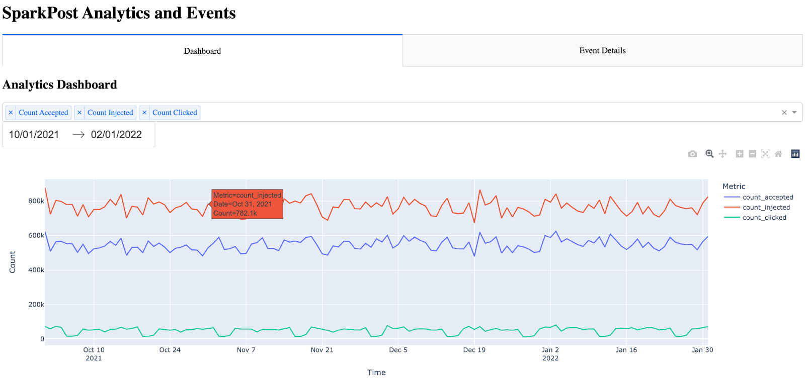
Remarque : de nombreux éléments sont intégrés automatiquement dans le graphique de bord (survol, zoom, échelle automatique).
Création de la page de détails de l'événement
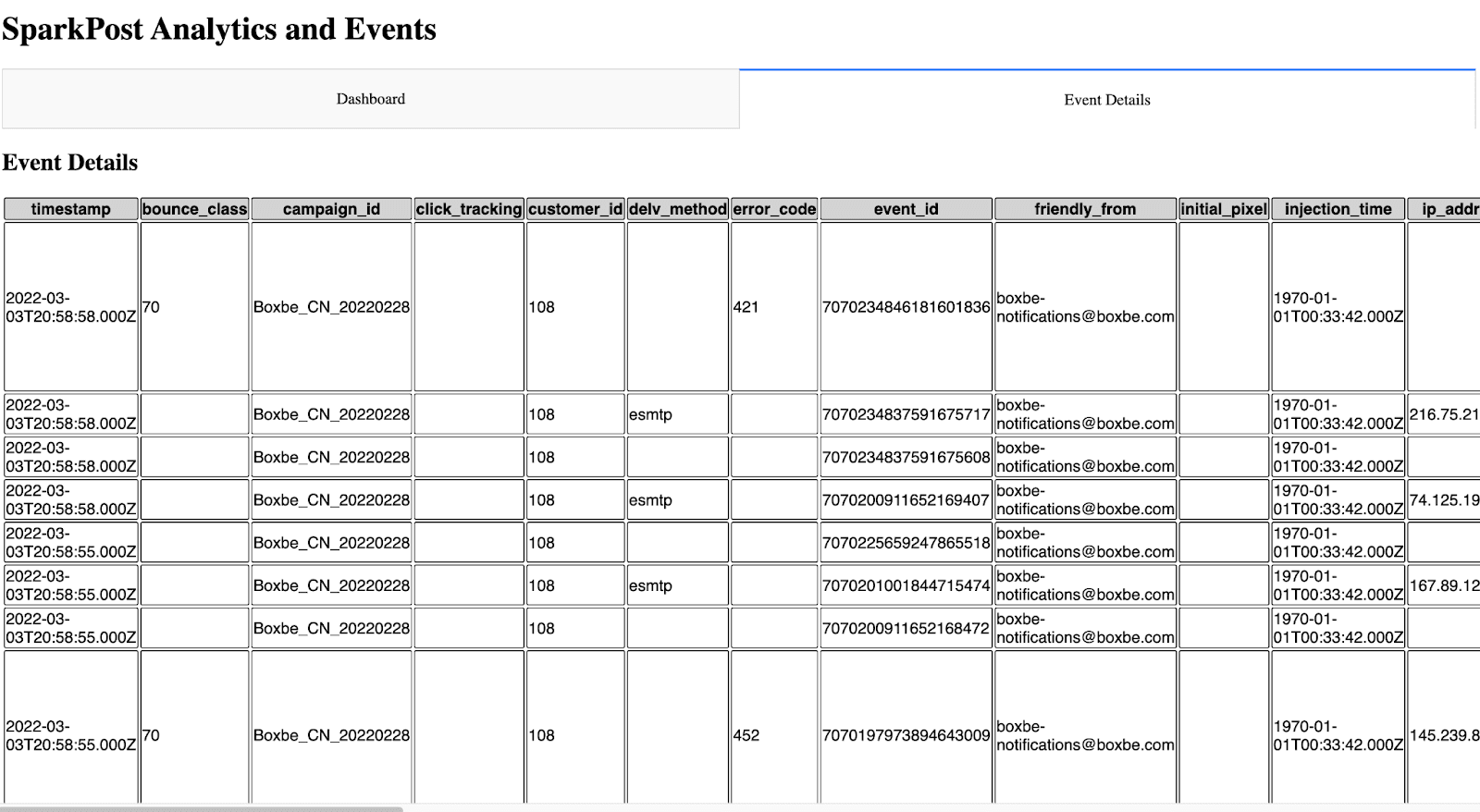
La page des détails de l'événement a été un peu plus difficile parce que je ne connaissais pas la meilleure façon de présenter toutes les mesures de l'événement d'une manière facile à lire. J'ai envisagé d'ajouter des paramètres de filtrage à cette page, mais j'ai décidé que cela ajouterait beaucoup de temps à ce projet car le tableau devrait alors être dynamique (avec l'ajout des paramètres, des rappels, etc.). J'ai décidé d'afficher tous les événements et de placer l'horodatage en premier (car sans l'horodatage, le graphique n'était pas facile à lire). Au début, j'ai trouvé qu'avec le HTML brut, le tableau était incroyablement difficile à regarder. Il n'y avait pas de bordures ni de différences de couleur entre l'en-tête et les lignes. Pour rendre le tableau plus lisible, j'ai pu utiliser le CSS dans Dash.
The idea for the event details is almost the same as the dashboard, except this time, I call the API sur les événements and bring in all events. Note the event details only shows the 10 most recent events (utilizing the max_rows parameter and API filtering). This can be increased, however, I settled on showing the 10 most recent events because the more events have shown, the longer the API call takes. One significant improvement that could be made would be the ability to paginate and include a Next Page / Previous Page in the UI.
Pour construire l'onglet (page) des événements, j'appelle d'abord l'API des événements et j'analyse la réponse JSON dans un cadre de données. Ensuite, je trie et réorganise le cadre de données pour placer l'horodatage en première colonne. Enfin, je construis le tableau HTML en itérant à travers le cadre de données.
#Build out and call the events API params = { "events" : "delivery,injection,bounce,delay,policy_rejection,out_of_band,open,click,generation_failure,generation_rejection,spam_complaint,list_unsubscribe,link_unsubscribe", "delimiter" : ",", "page" : "1", "per_page" : "10" } api_url = BASE_URL + "/events/message" response_API = requests.get(api_url, headers = {"Authorization" : API_KEY}, params=params) response_info = json.loads(response_API.text) new_df = pd.json_normalize(response_info, record_path=['results']) max_rows=10 #Max number of results show in the events table #Place timestamp as the first column in the table new_df = new_df.reindex(sorted(new_df.columns), axis=1) cols = ['timestamp'] new_df = new_df[cols + [c for c in new_df.columns if c not in cols]] #Show the new HTML with the events table (note, this table also references table.css) return html.Div([ html.H2("Event Details"), html.Table([ html.Thead( html.Tr([html.Th(col) for col in new_df.columns],className="table_css") ), html.Tbody([ html.Tr([ html.Td(new_df.iloc[i][col],className="table_css") for col in new_df.columns ]) for i in range(min(len(new_df), max_rows)) ]) ]) ])
Ce qui ressemble à ceci dans l'interface utilisateur.
Prochaines étapes
Pour quelqu'un qui cherche à créer son propre tableau de bord ou journal d'événements, c'est un bon début. Avec les possibilités de personnalisation offertes par cet outil, tout est possible.
Comme indiqué ci-dessus, certaines améliorations pourraient être apportées à l'avenir :
Ajouter des analyses de délivrabilité au tableau de bord
Ajouter des filtres au tableau de bord
Options de mise en cache possibles afin que l'API ne soit pas appelée à chaque fois pour afficher les pages
Améliorations de l'interface utilisateur
Ajout du filtrage et de la pagination à la page des détails de l'événement
I’d be interested in entendre tout retour d'information or suggestions for expanding this project.
~ Zach Samuels, Bird Ingénieur en chef des solutions