
Mar 24, 2022
A Dashboarding Tool with Bird APIs
Almost a year ago, Tom Mairs, Bird’s director of customer success, wrote a mailer tool utilizing Bird APIs. In this post, I pick up where he left off. His tool allows for timed transmission of jobs, but what if we want to create our own dashboards and event logs?
Perhaps I want to create a specific dashboard for a business group or a customer-facing dashboard, but not provide users full access to the Bird UI. This script just touches the surface of what is possible utilizing Python, Plotly Dash, and our APIs.
As I began my search online, I wanted to find the path of least resistance. I could have created all the dashboards and UI myself in HTML and python, however, after some Google searching, I came across Plotly’s Dash, which integrates easily with python. I chose Dash for 2 reasons: 1) it is open source, and 2) after reading the documentation it seemed easily customizable for what I was trying to do. Dash is an open-source library that is ideal for building and deploying data apps with customized user interfaces. This made creating a UI extremely simple. The question then became, how complex did I want to make this app? The more time I spent, the more features I wanted to add.
For the initial project, I wanted to ensure that I had a dashboard with customizable metrics and a selectable timeframe. Initially, I started with a dashboard where you could only pick one metric from the dropdown. Then, as I got feedback from colleagues, I refined the dashboard a little bit to add multi-select and axis titles. I also decided to add an additional tab for an events log. I came to the point where I was satisfied with what I had as a good starting point for anyone wishing to build out their own dashboards. Of course, I put the project in Github for you to clone or branch.
Getting Started
To access this app, you will need to ensure you are running python 3.10 or above and install the following libraries:
requests
dash
pandas
Then, input your API key into App.py and run the app. It will run on http://localhost:8050. For further information on deploying this to a public-facing server (such as AWS), see the following resources:
Creating the Dashboard Page
First, initialize the data frame and dashboard. Without initializing the dashboard, no dashboard will appear in the UI.
df = pd.DataFrame({
"Count": [0,0],
"Time": [0,0]
})
fig = px.line(df,x="Time",y="Count")
Then, build out the first tab. This is a combination of an app callback (to check which tab is being utilized); along with a conditional function to check which tab is currently selected. The code below builds out only the blank dashboard and UI elements (we will get to the events tab later on). The dcc elements are the Dash Core Components and the HTML Components easily allow for HTML to be used in the UI.
html.H2('Analytics Dashboard'),
#Multi-select dropdown
dcc.Dropdown(['Count Accepted','Count Admin Bounce','Count Block Bounce','Count Bounce','Count Clicked','Count Delayed', 'Count Delayed First','Count Delivered','Count Delivered First','Count Delivered Subsequent','Count Generation Failed', 'Count Generation Rejection','Count Hard Bounce','Count Inband Bounce','Count Initial Rendered','Count Injected', 'Count Out of Band Bounce', 'Count Policy Rejection','Count Rejected','Count Rendered','Count Sent','Count Soft Bounce', 'Count Spam Complaint','Count Targeted','Count Undetermined Bounce','Count Unique Clicked','Count Unique Confirmed Opened', 'Count Unique Initial Rendered','Count Unique Rendered','Count Unsubscribe','Total Delivery Time First','Total Delivery Time Subsequent', 'Total Message Volume'], id="y-axis", multi=True, searchable=True, placeholder="Select metrics(s)"),
#Date selector (max date allowed is set to today's date) dcc.DatePickerRange( id='date-picker-range', start_date=date(2022,1,1), end_date=date(2022, 2, 1), max_date_allowed=date(datetime.today().year,datetime.today().month,datetime.today().day), ),
#Graph object dcc.Graph( id='Emails', figure=fig )
Note with dash how simple creating a dashboard UI with a multi-select, searchable dropdown is. To disable multi-select or search, the parameters for creating a dropdown can be easily modified. I found that the most complex part of this project was building out the actual data frame from inputs, as well as getting the HTML + CSS to work correctly in the UI.
The Time Series Metrics API allows for 33 individual metrics to be pulled based on a date/time range. You can filter deeper by Domains, Campaigns, IP Pools, Sending Domains, Subaccounts, and specify the Precision of time-series data. These additional filters along with deliverability analytics could be a future improvement to this project (error catching would need to be implemented for clients who don’t have access to deliverability analytics).
Utilizing and calling the Metrics API, I build out a dashboard with the user’s selected parameters and specified timeframe. The initialized dashboard is then updated.
#Build the API call utilizing the parameters provided params = { "from" : start_date + "T00:00", "to" : end_date + "T00:00", "delimiter" : ",", "precision" : "day", "metrics" : joined_values } api_url = BASE_URL + "/metrics/deliverability/time-series" response_API = requests.get(api_url, headers = {"Authorization" : API_KEY}, params=params) response_info = json.loads(response_API.text) new_df = pd.json_normalize(response_info, record_path=['results']) value_array = joined_values.split(",") #Build out a new dashboard utilizing the new metrics and dates from the updated API call fig = px.line(new_df, x=new_df['ts'], y=value_array, labels={"value": "Count", "variable": "Metric","ts":"Date"}) fig.update_xaxes(title_text="Time") fig.update_yaxes(title_text="Count") return fig
The following is an example of multiple metrics selected and an expanded timeframe.
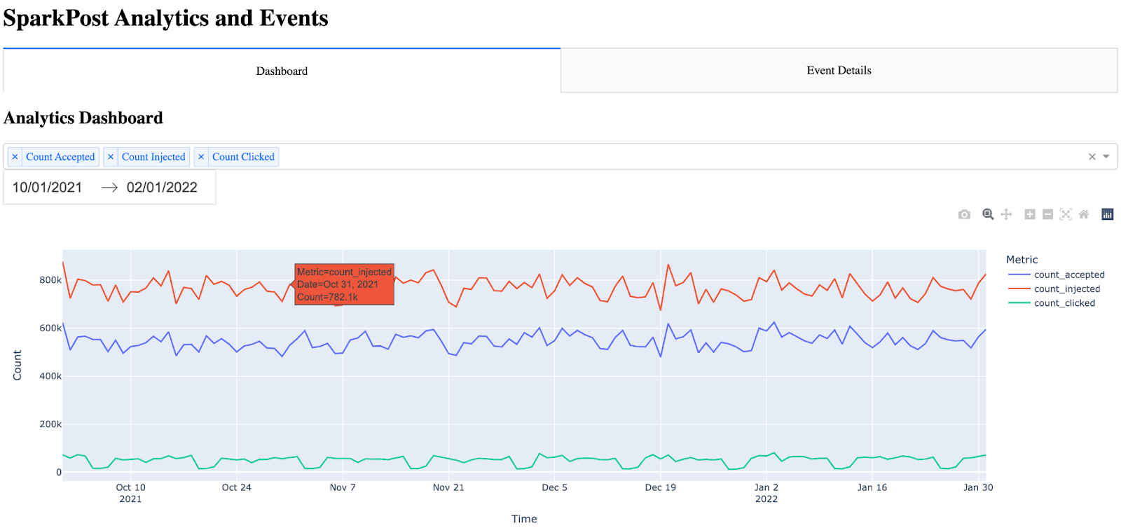
Note: there are many items built into the dash graph automatically (hover, zoom, autoscale).
Creating the Event Details Page
The event details page was a little more difficult because I didn’t know the best way to present all of the events metrics in an easy-to-read manner. I considered adding filtering parameters to this page, however, I decided that would add a significant amount of time to this project as the table would then have to be dynamic (along with adding the parameters, callbacks, etc.). I settled on showing all of the events and placing the timestamp first (as without putting the timestamp first, the chart wasn’t easy to read). Initially, I found that with just the raw HTML, the table was incredibly difficult on the eyes. There were no borders and no color differences for header vs rows. To make the table easier to read, I was able to use CSS within Dash.
The idea for the event details is almost the same as the dashboard, except this time, I call the Events API and bring in all events. Note the event details only shows the 10 most recent events (utilizing the max_rows parameter and API filtering). This can be increased, however, I settled on showing the 10 most recent events because the more events have shown, the longer the API call takes. One significant improvement that could be made would be the ability to paginate and include a Next Page / Previous Page in the UI.
To build out the events tab (page), first, I call the Events API and parse the JSON response into a data frame. Then I sort and reorder the data frame to put timestamp as the first column. Finally, I build out the HTML table by iterating through the data frame.
#Build out and call the events API params = { "events" : "delivery,injection,bounce,delay,policy_rejection,out_of_band,open,click,generation_failure,generation_rejection,spam_complaint,list_unsubscribe,link_unsubscribe", "delimiter" : ",", "page" : "1", "per_page" : "10" } api_url = BASE_URL + "/events/message" response_API = requests.get(api_url, headers = {"Authorization" : API_KEY}, params=params) response_info = json.loads(response_API.text) new_df = pd.json_normalize(response_info, record_path=['results']) max_rows=10 #Max number of results show in the events table #Place timestamp as the first column in the table new_df = new_df.reindex(sorted(new_df.columns), axis=1) cols = ['timestamp'] new_df = new_df[cols + [c for c in new_df.columns if c not in cols]] #Show the new HTML with the events table (note, this table also references table.css) return html.Div([ html.H2("Event Details"), html.Table([ html.Thead( html.Tr([html.Th(col) for col in new_df.columns],className="table_css") ), html.Tbody([ html.Tr([ html.Td(new_df.iloc[i][col],className="table_css") for col in new_df.columns ]) for i in range(min(len(new_df), max_rows)) ]) ]) ])
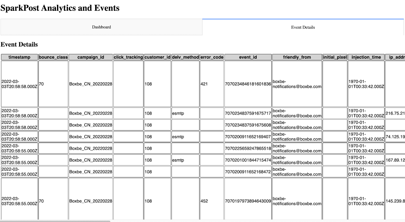
Which looks like this in the UI.
Next Steps
For someone looking to create their own dashboard or event log, this is a good start. With the customizability here, the sky’s the limit.
As discussed above, some future improvements that could be made are:
Adding deliverability analytics to the dashboard
Adding more filters to the dashboard
Possible caching options so the API isn’t being called every time to display the pages
UI Improvements
Adding filtering and pagination to the event details page
I’d be interested in hearing any feedback or suggestions for expanding this project.
~ Zach Samuels, Bird Senior Solutions Engineer