
Mar 24, 2022
A Dashboarding Tool with Bird 应用程序接口
将近一年前,Bird的客户成功总监 Tom Mairs 利用Bird API 编写了一个邮件发送工具。在这篇文章中,我将继续他的工作。他的工具允许定时传输作业,但如果我们想创建自己的仪表盘和事件日志呢?
Perhaps I want to create a specific dashboard for a business group or a customer-facing dashboard, but not provide users full access 到 Bird UI. This script just touches the surface of what is possible utilizing Python, Plotly Dash, and 我们的应用程序接口.
As I began my search online, I wanted to find the path of least resistance. I could have created all the dashboards and UI myself in HTML and python, however, after some Google searching, I came across Plotly's Dash, which integrates easily with python. I chose Dash for 2 reasons: 1) it is open source, and 2) after reading the documentation it seemed easily customizable for what I was trying to do. Dash 是一个开源库,非常适合构建和部署具有自定义用户界面的数据应用程序。 This made creating a UI extremely simple. ǞǞǞ question then became, how complex did I want to make this app? ǞǞǞ more time I spent, the more features I wanted to add.
For the initial project, I wanted to ensure that I had a dashboard with customizable metrics and a selectable timeframe. Initially, I started with a dashboard where you could only pick one metric from the dropdown. Then, as I got feedback from colleagues, I refined the dashboard a little bit to add multi-select and axis titles. I also decided to add an additional tab for an events log. I came 到 point where I was satisfied with what I had as a good starting point for anyone wishing to build out their own dashboards. Of course, I put the project in Github for you to clone or branch.
入门
To access this app, you will need to ensure you are running python 3.10 or above and install the following libraries:
要求
dash
大熊猫
Then, input your API key into App.py and run the app. It will run on http://localhost:8050. For further information on deploying this to a public-facing server (such as AWS), see the following resources:
创建仪表板页面
首先,初始化数据框和仪表盘。如果不初始化仪表盘,用户界面中将不会显示仪表盘。
df = pd.DataFrame({
"计数":[0,0],
时间[0,0]
})
fig = px.line(df,x="Time",y="Count")
Then, build out the first tab. This is a combination of an app callback (to check which tab is being utilized); along with a conditional function to check which tab is currently selected. The code below builds out only the blank dashboard and UI elements (we will get to the events tab later on). The dcc elements are the Dash 核心组件 and the HTML 组件 easily allow for HTML to be used in the UI.
html.H2('Analytics Dashboard')、
# 多选下拉菜单
dcc.Dropdown(['Count Accepted','Count Admin Bounce','Count Block Bounce','Count Bounce','Count Clicked','Count Delayed', 'Count Delayed First','Count Delivered','Count Delivered First','Count Delivered Subsequent',计数生成失败"、"计数生成拒绝"、"硬跳转计数"、"带内跳转计数"、"初始发送计数"、"注入计数"、"带外跳转计数"、"策略拒绝计数"、"拒绝计数"、重新生成计数"、"已发送计数"、"软跳转计数"、"垃圾邮件投诉计数"、"目标计数"、"未确定跳转计数"、"已点击计数"、"已确认打开计数"、"初始重新生成计数"、唯一转发计数"、"退订计数"、"首次总投递时间"、"后续总投递时间"、"邮件总量"], id="y-axis", multi=True, searchable=True, placeholder="Select metrics(s)")、
#日期选择器(允许的最大日期设置为今天的日期) dcc.DatePickerRange( id='date-picker-range', start_date=date(2022,1,1), end_date=date(2022, 2, 1), max_date_allowed=date(datetime.today().year,datetime.today().month,datetime.today().day), )、
#Graph 对象 dcc.Graph( id='Emails', figure=fig )
Note with dash how simple creating a dashboard UI with a multi-select, searchable dropdown is. To disable multi-select or search, the parameters for creating 下拉菜单 can be easily modified. I found that the most complex part of this project was building out the actual data frame from inputs, as well as getting the HTML + CSS to work correctly in the UI.
The 时间序列度量 API allows for 33 individual metrics to be pulled based on a date/time range. You can filter deeper by Domains, Campaigns, IP Pools, Sending Domains, Subaccounts, and specify the Precision of time-series data. These additional filters along with deliverability analytics could be a future improvement to this project (error catching would need to be implemented for clients who don’t have access to deliverability analytics).
Utilizing and calling the 度量 API, I build out a dashboard with the user’s selected parameters and specified timeframe. The initialized dashboard is then updated.
#Build the API call utilizing the parameters provided params = { "from" : start_date + "T00:00", "to" : end_date + "T00:00", "delimiter" : ",", "precision" : "day", "metrics" : joined_values } api_url = BASE_URL + "/metrics/deliverability/time-series" response_API = 要求.get(api_url, headers = {"Authorization" : API_KEY}, params=params) response_info = json.loads(response_API.text) new_df = pd.json_normalize(response_info, record_path=['results']) value_array = joined_values.split(",") #Build out a new dashboard utilizing the new metrics and dates from the updated API call fig = px.line(new_df, x=new_df['ts'], y=value_array, labels={"value": "Count", "variable": "Metric","ts":"Date"}) fig.update_xaxes(title_text="Time") fig.update_yaxes(title_text="Count") return fig
下面是选择多个指标和扩大时间范围的示例。
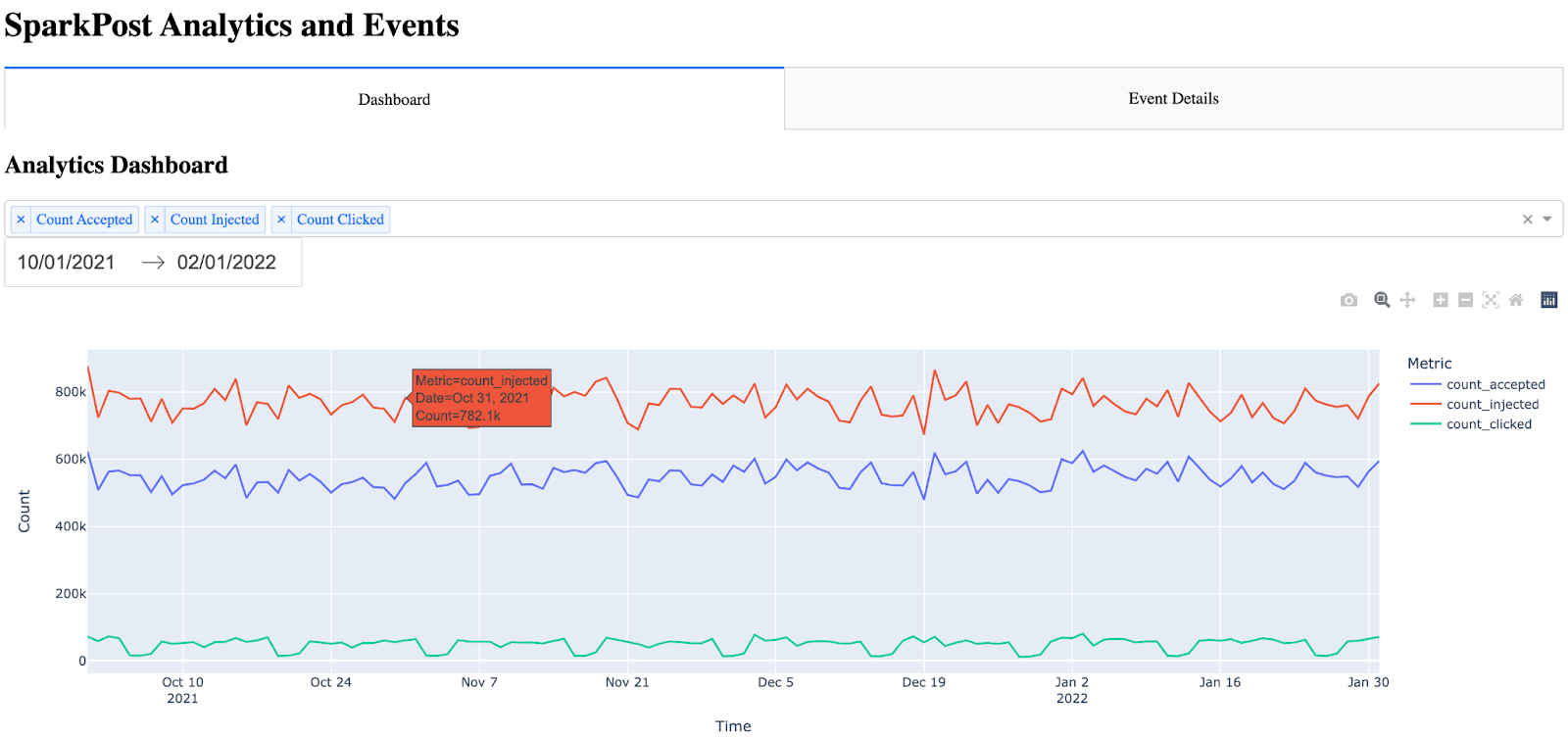
注意:仪表盘图形中自动内置了许多项目(悬停、缩放、自动缩放)。
创建活动详情页面
事件详情页比较困难,因为我不知道用什么最好的方法来以易于阅读的方式展示所有事件指标。我考虑过在该页面添加过滤参数,但我认为这将增加项目的大量时间,因为表格必须是动态的(同时还要添加参数、回调等)。我最终决定显示所有事件,并把时间戳放在前面(因为如果不把时间戳放在前面,图表就不容易阅读)。起初,我发现只有原始 HTML 的表格非常难看。表格没有边框,标题和行的颜色也没有区别。为了让表格更容易阅读,我在 Dash 中使用了 CSS。
The idea for the event details is almost the same as the dashboard, except this time, I call the 活动 API and bring in all events. Note the event details only shows the 10 most recent events (utilizing the max_rows parameter and API filtering). This can be increased, however, I settled on showing the 10 most recent events because the more events have shown, the longer the API call takes. One significant improvement that could be made would be the ability to paginate and include a Next Page / Previous Page in the UI.
要创建 "事件 "选项卡(页面),首先要调用 "事件 "API,并将 JSON 响应解析为数据帧。然后对数据帧进行排序和重新排序,将时间戳作为第一列。最后,我通过遍历数据帧来创建 HTML 表格。
#Build out and call the events API params = { "events" : "delivery,injection,bounce,delay,policy_rejection,out_of_band,open,click,generation_failure,generation_rejection,spam_complaint,list_unsubscribe,link_unsubscribe", "delimiter" : ",", "page" : "1", "per_page" : "10" } api_url = BASE_URL + "/events/message" response_API = requests.get(api_url, headers = {"Authorization" : API_KEY}, params=params) response_info = json.loads(response_API.text) new_df = pd.json_normalize(response_info, record_path=['results']) max_rows=10 #Max number of results show in the events table #Place timestamp as the first column in the table new_df = new_df.reindex(sorted(new_df.columns), axis=1) cols = ['timestamp'] new_df = new_df[cols + [c for c in new_df.columns if c not in cols]] #Show the new HTML with the events table (note, this table also references table.css) return html.Div([ html.H2("Event Details"), html.Table([ html.Thead( html.Tr([html.Th(col) for col in new_df.columns],className="table_css") ), html.Tbody([ html.Tr([ html.Td(new_df.iloc[i][col],className="table_css") for col in new_df.columns ]) for i in range(min(len(new_df), max_rows)) ]) ]) ])
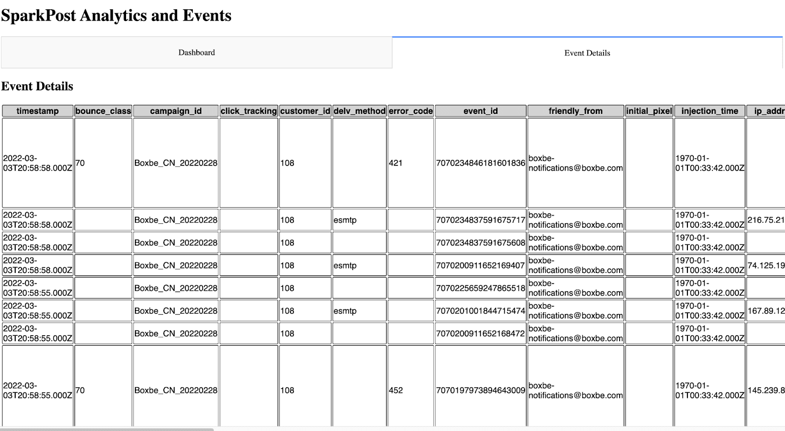
在用户界面上看起来是这样的。
下一步工作
对于想要创建自己的仪表盘或事件日志的人来说,这是一个良好的开端。有了它的可定制性,就有了无限可能。
如上文所述,今后可以改进的地方有
在仪表板中添加交付能力分析
为仪表板添加更多筛选器
可能的缓存选项,这样就不会在每次显示页面时都调用应用程序接口
改进用户界面
为活动详情页面添加筛选和分页功能
I’d be interested in 听取任何反馈意见 or suggestions for expanding this project.
~ Zach Samuels,Bird 高级解决方案工程师