
Mar 24, 2022
A Dashboarding Tool with Bird APIs
Hace casi un año, Tom Mairs, director de éxito de clientes de Bird, escribió una herramienta de envío de correo utilizando las API de Bird . En este post, continúo donde él lo dejó. Su herramienta permite la transmisión temporizada de trabajos, pero ¿qué pasa si queremos crear nuestros propios cuadros de mando y registros de eventos?
Perhaps I want to create a specific dashboard for a business group or a customer-facing dashboard, but not provide users full access a la Bird UI. This script just touches the surface of what is possible utilizing Python, Plotly Dash, and nuestras API.
As I began my search online, I wanted to find the path of least resistance. I could have created all the dashboards and UI myself in HTML and python, however, after some Google searching, I came across Plotly's Dash, which integrates easily with python. I chose Dash for 2 reasons: 1) it is open source, and 2) after reading the documentation it seemed easily customizable for what I was trying to do. Dash es una biblioteca de código abierto ideal para crear e implantar aplicaciones de datos con interfaces de usuario personalizadas. This made creating a UI extremely simple. En question then became, how complex did I want to make this app? En more time I spent, the more features I wanted to add.
For the initial project, I wanted to ensure that I had a dashboard with customizable metrics and a selectable timeframe. Initially, I started with a dashboard where you could only pick one metric from the dropdown. Then, as I got feedback from colleagues, I refined the dashboard a little bit to add multi-select and axis titles. I also decided to add an additional tab for an events log. I came a la point where I was satisfied with what I had as a good starting point for anyone wishing to build out their own dashboards. Of course, I put the project in Github for you to clone or branch.
Primeros pasos
To access this app, you will need to ensure you are running python 3.10 or above and install the following libraries:
solicita
dash
pandas
Then, input your API key into App.py and run the app. It will run on http://localhost:8050. For further information on deploying this to a public-facing server (such as AWS), see the following resources:
Creación de la página del cuadro de mando
En primer lugar, inicialice el marco de datos y el cuadro de mando. Sin inicializar el cuadro de mando, no aparecerá ningún cuadro de mando en la interfaz de usuario.
df = pd.DataFrame({
"Count": [0,0],
"Tiempo": [0,0]
})
fig = px.line(df,x="Tiempo",y="Recuento")
Then, build out the first tab. This is a combination of an app callback (to check which tab is being utilized); along with a conditional function to check which tab is currently selected. The code below builds out only the blank dashboard and UI elements (we will get to the events tab later on). The dcc elements are the Componentes principales de Dash and the Componentes HTML easily allow for HTML to be used in the UI.
html.H2('Panel de análisis'),
#Desplegable de selección múltiple
dcc.Dropdown(['Recuento aceptado','Recuento de rebotes de administración','Recuento de rebotes en bloque','Recuento de rebotes','Recuento de clics','Recuento retrasado','Recuento retrasado primero','Recuento entregado','Recuento entregado primero','Recuento entregado después',"Count Generation Failed", "Count Generation Rejection", "Count Hard Bounce", "Count Inband Bounce", "Count Initial Rendered", "Count Injected", "Count Out of Band Bounce", "Count Policy Rejection", "Count Rejected",Recuento Renderizado", "Recuento Enviado", "Recuento Soft Bounce", "Recuento Spam Complaint", "Recuento Targeted", "Recuento Undetermined Bounce", "Recuento Unique Clicked", "Recuento Unique Confirmed Opened", "Recuento Unique Initial Rendered",Recuento de únicos entregados','Recuento de bajas','Tiempo total de entrega inicial','Tiempo total de entrega posterior','Volumen total de mensajes'], id="eje y", multi=True, searchable=True, placeholder="Seleccionar métrica(s)"),
#Selector de fecha (la fecha máxima permitida se establece en la fecha de hoy) dcc.DatePickerRange( id='date-picker-range', start_date=fecha(2022,1,1), end_date=fecha(2022, 2, 1), max_date_allowed=fecha(datetime.today().year,datetime.today().month,datetime.today().day), ),
#Objeto gráfico dcc.Graph( id='Emails', figure=fig )
Note with dash how simple creating a dashboard UI with a multi-select, searchable dropdown is. To disable multi-select or search, the parameters for creating un desplegable can be easily modified. I found that the most complex part of this project was building out the actual data frame from inputs, as well as getting the HTML + CSS to work correctly in the UI.
The API de métricas de series temporales allows for 33 individual metrics to be pulled based on a date/time range. You can filter deeper by Domains, Campaigns, IP Pools, Sending Domains, Subaccounts, and specify the Precision of time-series data. These additional filters along with deliverability analytics could be a future improvement to this project (error catching would need to be implemented for clients who don’t have access to deliverability analytics).
Utilizing and calling the API de métricas, I build out a dashboard with the user’s selected parameters and specified timeframe. The initialized dashboard is then updated.
#Build the API call utilizing the parameters provided params = { "from" : start_date + "T00:00", "to" : end_date + "T00:00", "delimiter" : ",", "precision" : "day", "metrics" : joined_values } api_url = BASE_URL + "/metrics/deliverability/time-series" response_API = solicita.get(api_url, headers = {"Authorization" : API_KEY}, params=params) response_info = json.loads(response_API.text) new_df = pd.json_normalize(response_info, record_path=['results']) value_array = joined_values.split(",") #Build out a new dashboard utilizing the new metrics and dates from the updated API call fig = px.line(new_df, x=new_df['ts'], y=value_array, labels={"value": "Count", "variable": "Metric","ts":"Date"}) fig.update_xaxes(title_text="Time") fig.update_yaxes(title_text="Count") return fig
A continuación se muestra un ejemplo de múltiples métricas seleccionadas y un marco temporal ampliado.
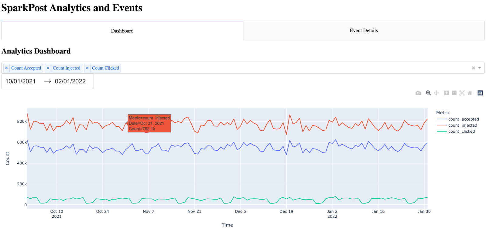
Nota: hay muchos elementos integrados automáticamente en el gráfico (hover, zoom, autoescala).
Creación de la página de detalles del evento
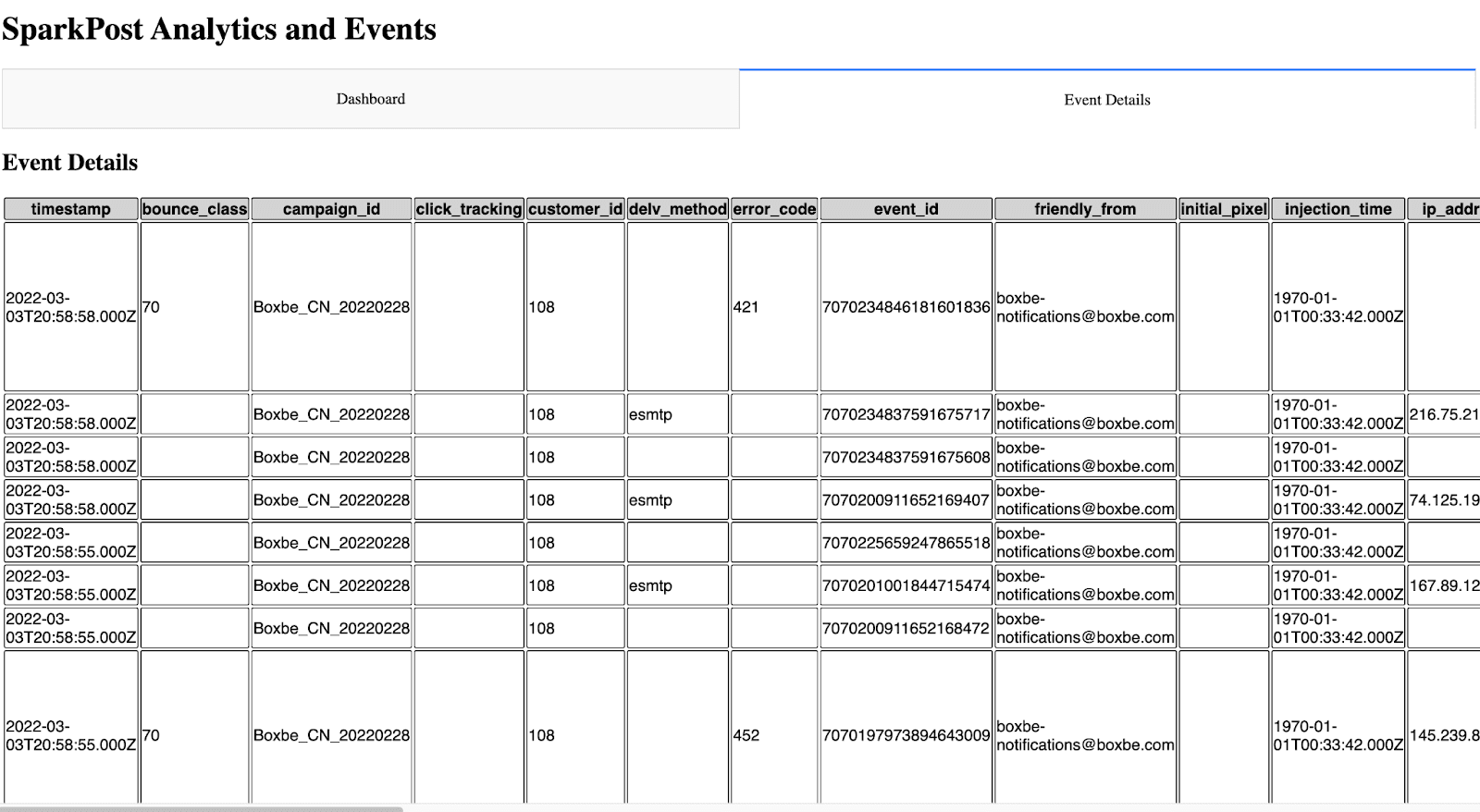
La página de detalles del evento fue un poco más difícil porque no sabía la mejor manera de presentar todas las métricas de los eventos de una manera fácil de leer. Consideré añadir parámetros de filtrado a esta página, sin embargo, decidí que añadiría una cantidad significativa de tiempo a este proyecto ya que la tabla tendría que ser dinámica (junto con la adición de los parámetros, callbacks, etc.). Me decidí a mostrar todos los eventos y colocar la marca de tiempo en primer lugar (ya que sin poner la marca de tiempo en primer lugar, el gráfico no era fácil de leer). Al principio, me di cuenta de que con sólo el HTML en bruto, la tabla era increíblemente difícil para los ojos. No había bordes ni diferencias de color entre la cabecera y las filas. Para hacer la tabla más fácil de leer, pude usar CSS dentro de Dash.
The idea for the event details is almost the same as the dashboard, except this time, I call the API de eventos and bring in all events. Note the event details only shows the 10 most recent events (utilizing the max_rows parameter and API filtering). This can be increased, however, I settled on showing the 10 most recent events because the more events have shown, the longer the API call takes. One significant improvement that could be made would be the ability to paginate and include a Next Page / Previous Page in the UI.
Para crear la pestaña de eventos (página), primero llamo a la API de eventos y analizo la respuesta JSON en un marco de datos. A continuación, ordeno y reordeno el marco de datos para poner la fecha y hora como primera columna. Finalmente, construyo la tabla HTML iterando a través del marco de datos.
#Build out and call the events API params = { "events" : "delivery,injection,bounce,delay,policy_rejection,out_of_band,open,click,generation_failure,generation_rejection,spam_complaint,list_unsubscribe,link_unsubscribe", "delimiter" : ",", "page" : "1", "per_page" : "10" } api_url = BASE_URL + "/events/message" response_API = requests.get(api_url, headers = {"Authorization" : API_KEY}, params=params) response_info = json.loads(response_API.text) new_df = pd.json_normalize(response_info, record_path=['results']) max_rows=10 #Max number of results show in the events table #Place timestamp as the first column in the table new_df = new_df.reindex(sorted(new_df.columns), axis=1) cols = ['timestamp'] new_df = new_df[cols + [c for c in new_df.columns if c not in cols]] #Show the new HTML with the events table (note, this table also references table.css) return html.Div([ html.H2("Event Details"), html.Table([ html.Thead( html.Tr([html.Th(col) for col in new_df.columns],className="table_css") ), html.Tbody([ html.Tr([ html.Td(new_df.iloc[i][col],className="table_css") for col in new_df.columns ]) for i in range(min(len(new_df), max_rows)) ]) ]) ])
Que tiene este aspecto en la interfaz de usuario.
Próximos pasos
Para alguien que quiera crear su propio panel de control o registro de eventos, este es un buen comienzo. Con las posibilidades de personalización que ofrece, el cielo es el límite.
Como ya se ha comentado, algunas de las mejoras que podrían introducirse en el futuro son:
Añadir análisis de entregabilidad al cuadro de mandos
Añadir más filtros al cuadro de mandos
Posibles opciones de almacenamiento en caché para que no se llame a la API cada vez que se muestren las páginas.
Mejoras en la interfaz de usuario
Añadir filtrado y paginación a la página de detalles del evento
I’d be interested in escuchar cualquier comentario or suggestions for expanding this project.
~ Zach Samuels, Bird Ingeniero Superior de Soluciones