
Nov 15, 2017
5 Best Practices for Security Notifications
Everyone using technology today (and that is everyone) faces a wide range of security challenges. Devices can be lost or stolen. Accounts can be hacked. Personal information can be leaked online.
So it goes without saying that good security is a key requirement for any SaaS app today. But it’s not enough to just to build secure technology; user attitudes and behaviors also are critical to building a successful and secure SaaS product.
Security alerts and notifications are one important part of developing and reinforcing user trust. To be effective, product teams developing security notifications for their apps should consider how their alerts can accomplish two goals:
Help users make good decisions about security-related issues
Convey the information users need to have confidence in the product or service
In this post, I’ll take a look at several examples of effective security notification emails and the lessons product teams can learn from them.
1. Give users clear, helpful information
This email from Apple is generated when a user can’t find their iOS device and turns to the Find iPhone app for help. They can use the app to turn on Lost Mode, which tells the missing device to ping the mother ship and provide its location, which Apple quickly provides in the form of an email that looks like this.
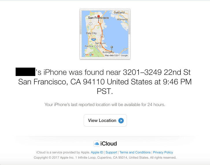
Notice how Apple prominently displays plenty of useful information in this email. They even include a map that shows the wayward phone’s journey. When the user clicks View Location, they’re sent to an online map that shows them the current location of their device, along with various options that can help them recover it.
Apple also wisely forgoes explicit marketing or brand messaging. The last thing a user needs is to feel like they’re being sent an advertisement when they’re worried that they’ve lost an expensive piece of hardware. The iCloud logo isn’t prominent, and it’s there more as a way to remind the user about the service that they’re relying on, and to point them toward the helpful links at the bottom.
2. Quickly notify users about unusual account activity
If you’ve ever used Facebook through a new device or web browser, you’ve probably encountered extra layers of security that go beyond a simple login screen. Users with 2-factor authentication (2FA) are required to enter a code generated in the Facebook app on an already-trusted device. And even when a code is successfully entered, Facebook immediately sends post-log-in emails to all addresses associated with the account, along with in-app notifications.
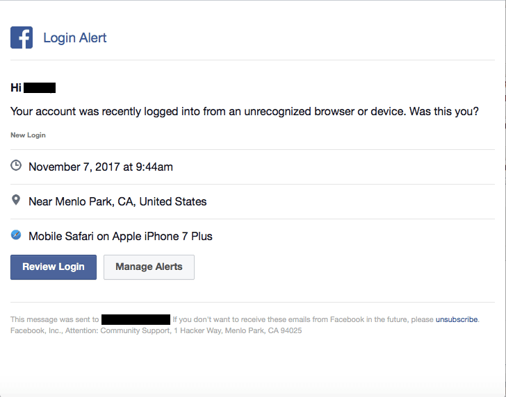
Like Apple’s Find iPhone email, they stick to the necessary information and don’t turn the message into an ad. The straight-forward branding reassures the recipient that Facebook is looking out for them.
Just as importantly, the buttons provide clear, actionable next steps, just in case the user is surprised by this notice and needs to do something about it. Notice that Facebook uses their primary brand color for the more important of the two CTAs.
And if these kinds of alerts are annoying, they provide an option that takes the user to a place where they can manage how and when they receive alerts. There’s also an unsubscribe link at the bottom for people who don’t want to be bothered at all with these kinds of messages in the future.
3. Take extra care with password resets
It’s a good idea to include email in the flow when someone resets their password, in case their account has been accessed by a bad actor. You should send them an email notification and require them to visit a web page to reset their password. It may be a bit of a hassle, but it’s a step that adds a layer of security to the process, like Steam does here.
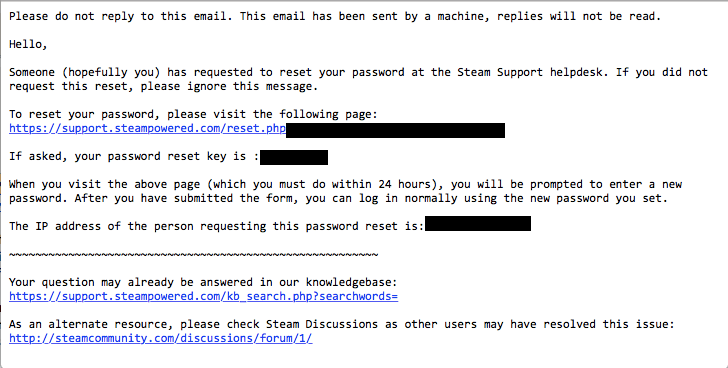
Sure, you could question the plaintext style, but there are times a no-frills approach is appropriate, depending upon the needs and preferences of your audience.
This email also does a good job of setting expectations for the user:
A human didn’t send this, so please don’t reply – the links below will hopefully help you if you’re confused.
Click the link and use a manually entered password reset key. It’s simple, and using a random key rather than personally identifiable information helps allay possible user fears of phishing.
Here’s the IP address of the person who made this request, so you have it in case you didn’t do this and need to take action against the person who did.
4. Be mindful of actions that make users nervous
Even the savviest Internet users can hesitate when making a change to how they conduct business online. For example, if your service offers a new option that will make transactions more convenient for customers, they may still be a little nervous about the implications of that change. See what PayPal did here as an example of how to handle this kind of triggered event.
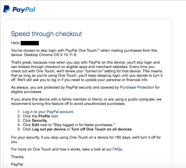
It’s a lengthy email, but given the subject matter, it’s one that’s likely to be read with greater care than a “You sent money to so-and-so” message. PayPal uses the beginning of the email to clearly lay out the change made and which device it affects. Then they explain the benefits, followed by an assurance that Purchase Protection still applies. They close with step-by-step instructions for turning off the feature if the user realizes that they share the device with other people.
PayPal keeps the branding to a minimum and doesn’t bother with images or anything else that says “this is a marketing message,” which helps reassure the user that the company has their best interests at heart and isn’t looking at this as an opportunity to sell them something.
5. Treat security as an ongoing part of the user experience
Sometimes, it’s helpful to simply let users know about the ways you can help them achieve peace of mind, even if the message isn’t tied to a triggered event. This email from Wells Fargo, which introduces their new Security Center feature, does a good job of that.
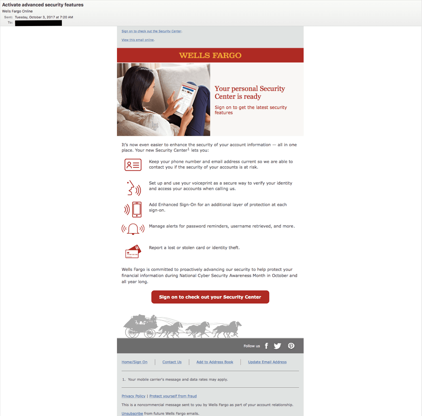
Even marketing messages like this can help reinforce the overall trust a user has for a service. This one emphasizes a useful new feature that customers are likely to appreciate, given the fact that website hacks and information leaks pop up in the news on a regular basis. The iconography helps break up the email so it’s not too text-heavy, and it ends with a clear CTA. And while it’s likely that many people don’t know much about National Cyber Security Awareness Month, it was still smart of Wells Fargo to tie this feature roll-out to that event.
They also use a clear, direct subject line and “From:” address, both of which help the message stand out a little more in a cluttered inbox.